Signed in as:
filler@godaddy.com
OPPORTUNITY
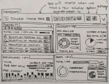
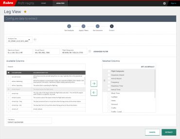
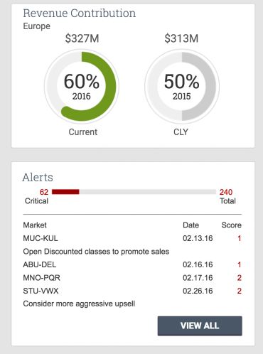
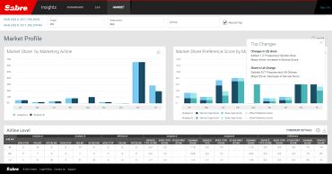
The planning software that we worked on for 18 months contains several companion modules that integrate and deliver complete support for most of the airline planning operations. One of this modules focuses on data analysis to find potential target markets and render results to strategize profitability margins.
This solution process data with several algorithms designed to identify airline profit margins and offers hints as to how to increase them. Most of this solution had been designed to integrate with Excel and forced users to export multiple spreadsheets that had to be analyzed with other supporting products.
70% of the users defined this process as a problem, but where incredibly satisfied with the quality of the data that they’ve been willing to struggle through that process. We made a goal for 2017 to change that.

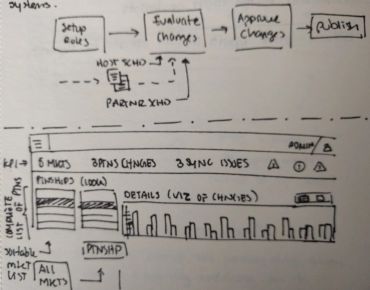
The first red flag for me was when in a global gathering of our customers we conducted a satisfaction survey and 70% of our users focused on a single pain point. Once we identified this as an opportunity we started conducting interviews with product experts (users). With this information, we started a process diagram and task analysis.
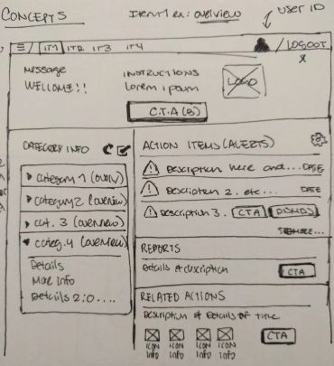
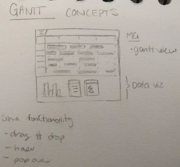
With that data, we coordinated another workshop with the customers where we outline accelerators in their daily tasks, and also had a little demo of what we thought the end goal of the product could look like. This got outstanding reviews and we decided to move with ahead with a Design Sprint to continue growing the vision of what this data analytics module could look like for 2020.
METHODOLOGY